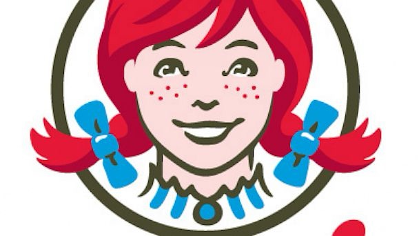
Fast food chains are known for their tasty meals and recognizable branding, and Wendy’s is no exception. The chain, famous for its burgers, fries, and Frostys, has an iconic logo that almost everyone can picture: a smiling red-haired girl with freckles and blue bows in her pigtails. But have you ever noticed the hidden detail in that logo?
Wendy’s was named after the daughter of its founder, Dave Thomas. He wanted the brand to feel warm and welcoming, much like home-cooked meals shared with family. To emphasize this family connection, Thomas included a subtle but meaningful detail in the design of the logo. If you look closely at Wendy’s ruffled collar, you’ll see the word “MOM” cleverly spelled out.
This hidden message isn’t just a random addition. It’s meant to symbolize the idea of home, love, and comfort—qualities that many associate with their mothers and the meals they prepare. By adding this subtle touch, the logo not only represents the founder’s daughter but also reflects a broader sense of family and tradition.

Wendy’s isn’t the only brand to include creative details in its logo. For instance, Subway’s logo features two arrows pointing in opposite directions—one at the “S” and another at the “Y.” These arrows represent the entrance and exit of a subway, tying the brand name to its design.
These little details may not be immediately noticeable, but they show how much thought goes into branding. They create a deeper connection with customers, making the logos memorable and meaningful.
Next time you visit Wendy’s, take a closer look at the logo and see if you can spot the “MOM” in the collar. It’s a reminder that sometimes even the simplest designs have hidden stories, making them all the more special.


